Luxmi Tea
Back in 2011, Rudra Chatterjee from Luxmi Tea took a chance on me - a novice designer to create a book for his family’s company. And just like that, Luxmi Tea was my very first large commercial project. I remember that I didn’t know at the time how to draw up an invoice, how to make a contract, or for that matter, how to use InDesign.
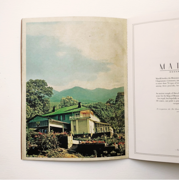
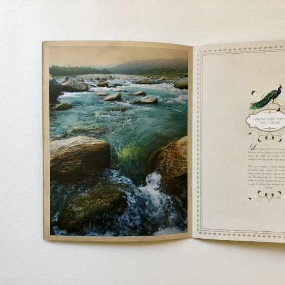
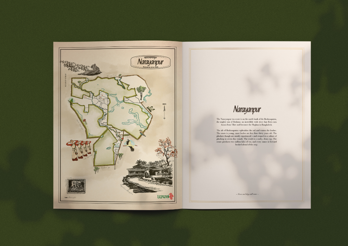
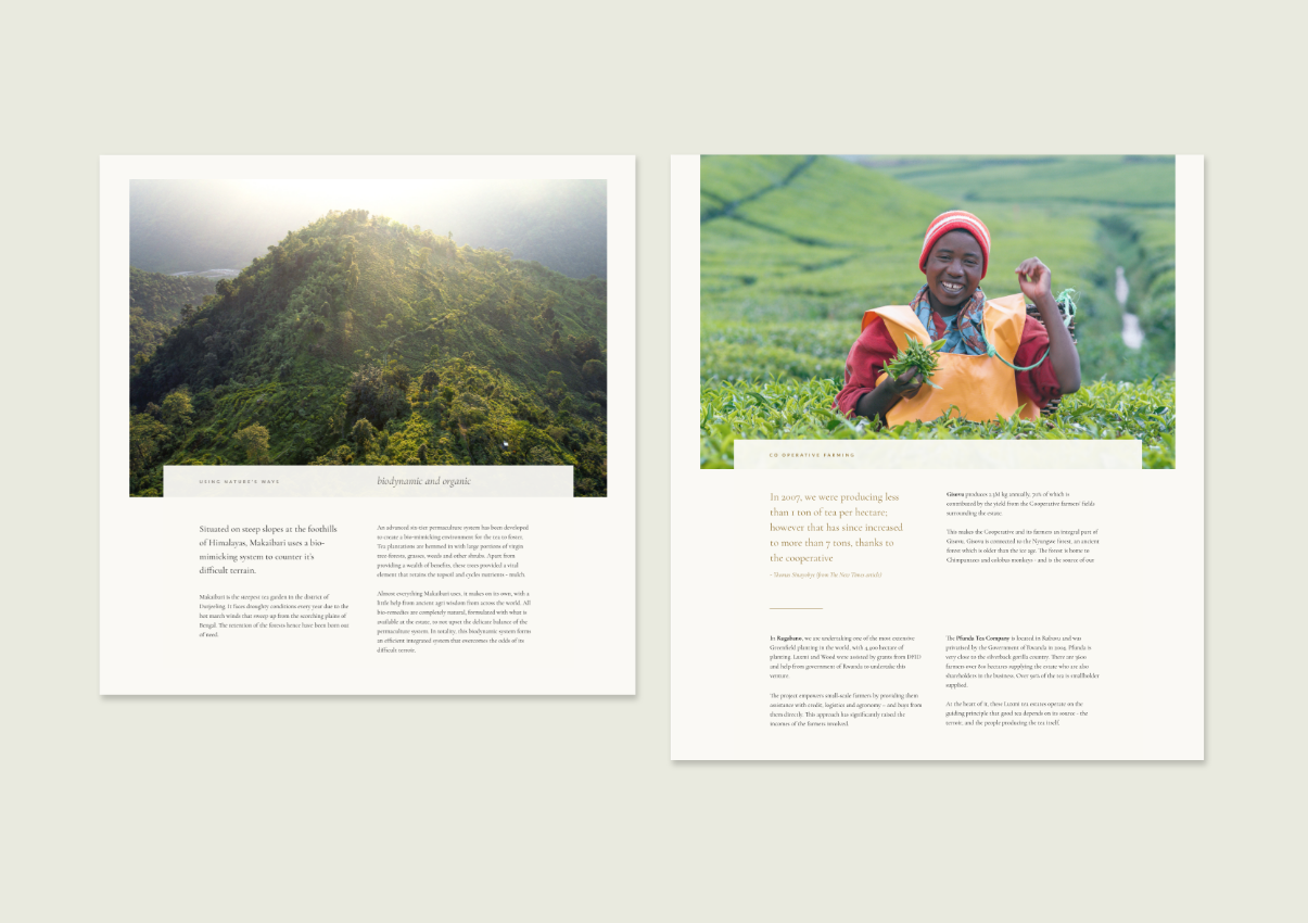
It took me a year to create this 40-page book that both Rudra and I poured our hearts into. Unlike any other corporate brochure, we made this personal and told the story of this 100-year company with humility and grace. Rudra wrote all the copy himself, and I was given a completely free hand to work on the visuals.
I started this brochure with the map of the Matelli estate, and much like the slow life at the plantations, it took me 45 days to illustrate this with my newly acquired Wacom tablet (with the help of my mum, who was studying digital artistry at the time). For the brochure, I picked the peacock element and decided to use this as a recurring element the brochure. At that point, I did not have the liberty to shoot new images from my project, so I worked with archival photographs, merging and editing, adding jewel tones for it to work in the book.
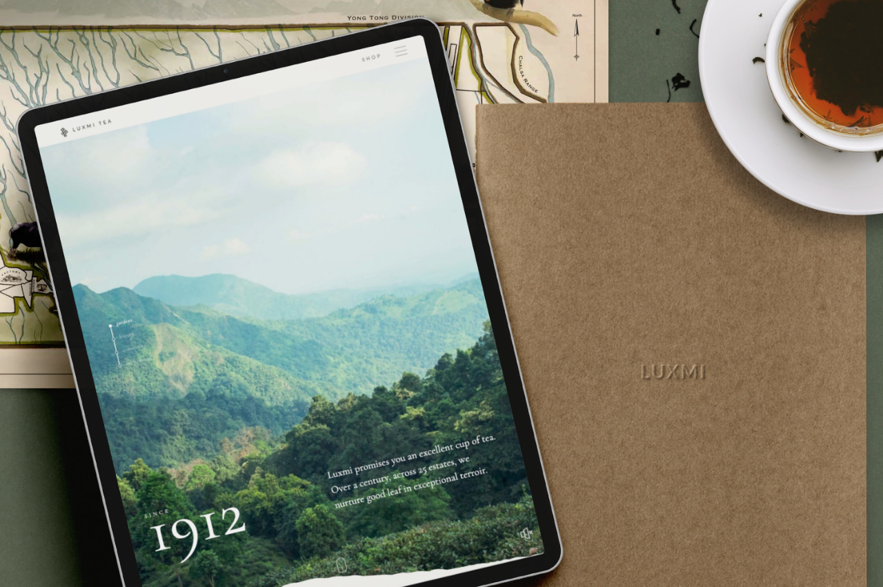
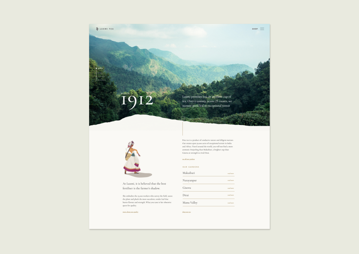
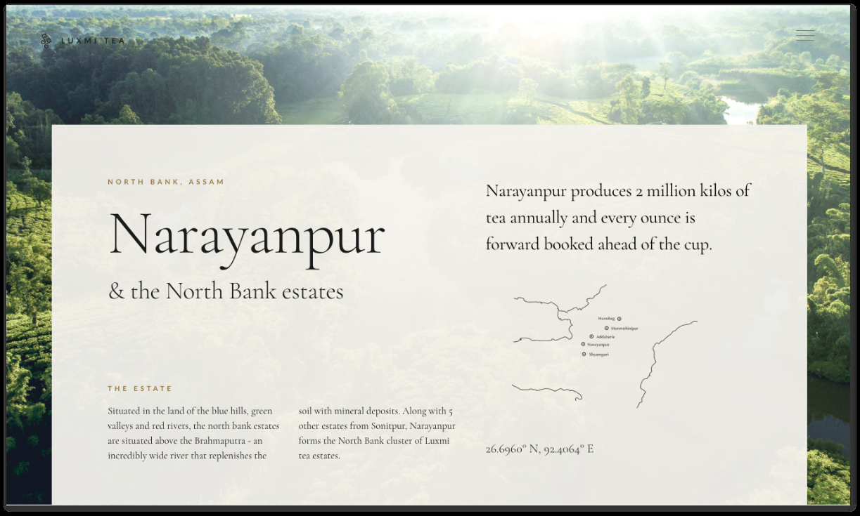
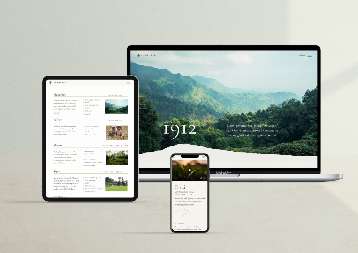
9 years later, they had acquired a few more estates (some world-famous ones too) and wanted to create version 2 of this book. I suggested, why not create a website instead, that carries the same feeling as the book.
We sent a team up to the estates to capture with drones, the magic of the Himalayas. The rolling mist ran through hilltops, meandering stream beds frequented by elephants, a wooden tea factory, cane baskets full of leaves, and sunlight streaming through a dense forest.
We wanted to show tea as a living breathing souvenir from the eternal mountains. It’s the magic of the forests we put into our bodies, nourished by all its organisms - the insects, the wildlife, the streams. Our food is our relationship with the earth. As Rudra says - it’s not an empty fix of caffeine sold by a tabla artist saying “wah taj”.
We started building the corporate site in October 2019 and finished in March 2020. The world was slowly going into lockdown, and it was the perfect opportunity to add to the site - a shoppable component. With more people staying home, and yearning for the outdoors, it was a perfect time to retail the tea, as a vicarious taste of the hills.
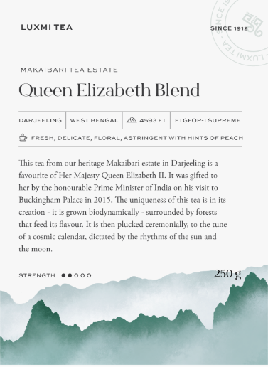
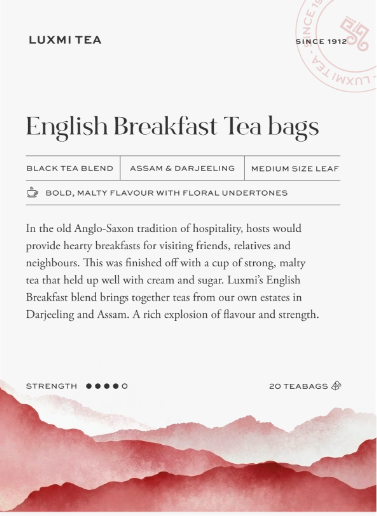
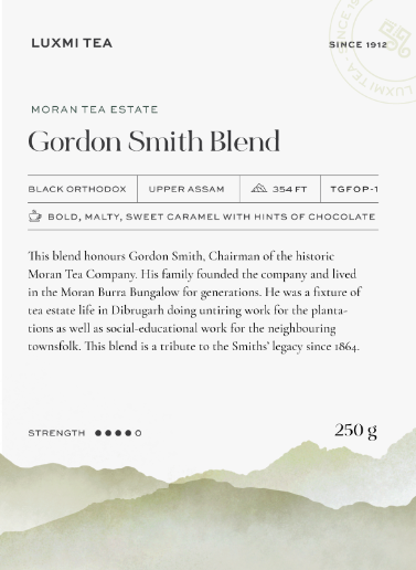
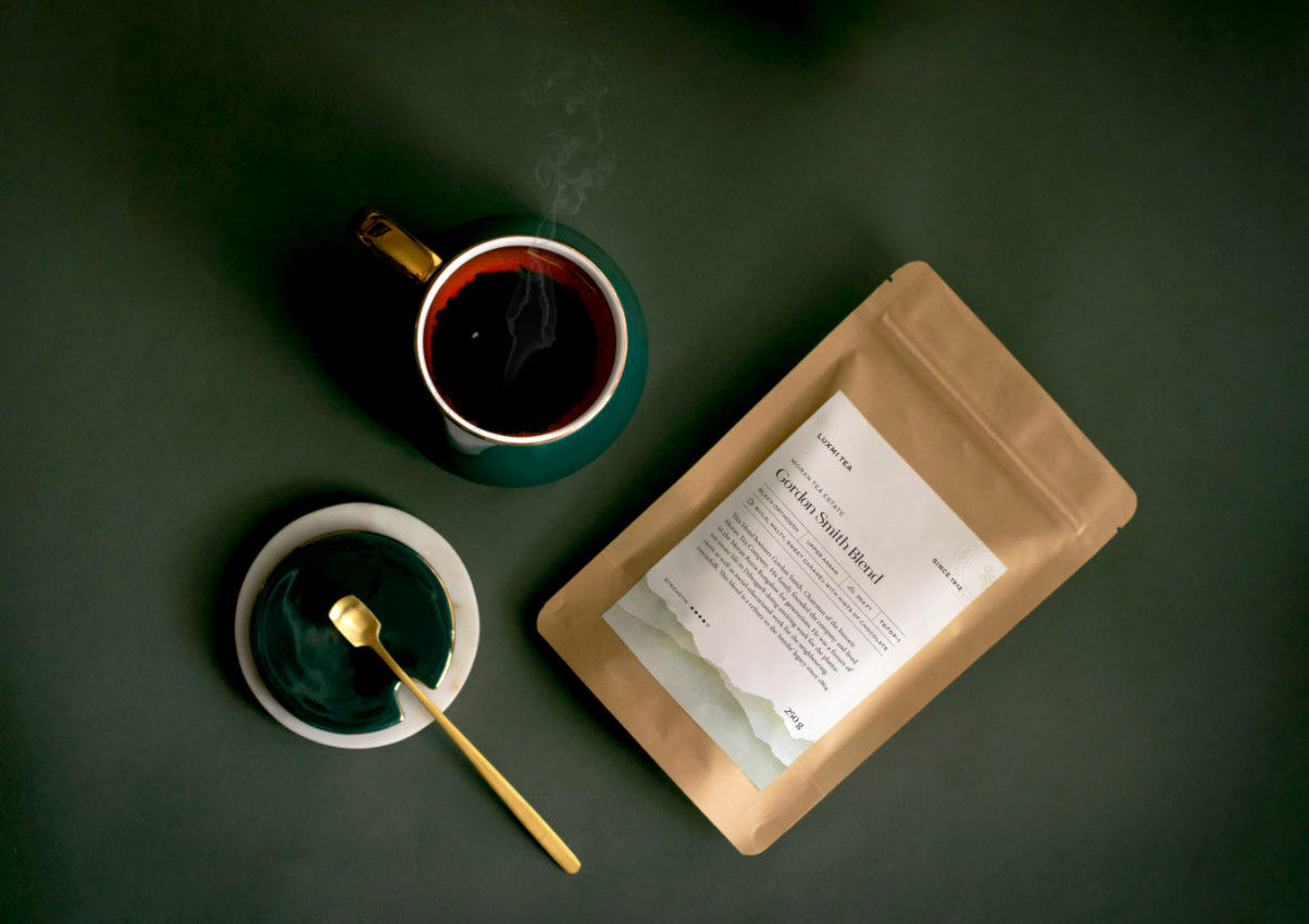
We created 9 labels, each based on its beautiful source and its colorful history. With short entertaining anecdotes and a silhouette of the landscape, we extended the approach of the site, onto the labels.
Now in order to showcase the product, we needed the tea to take photographs of it, but we had none. Bang in the middle of lockdown, with extremely sketchy network coverage up on the hills, we sent video tutorials to 7 different estate managers on how to shoot the leaves, as even courier services weren’t functional at that point.
We used Shopify to build a very simple catalog of products, and within 10 days of deciding to retail the tea, we were live.
Even though the labels seem simple, this wasn’t our first cut. On Mr. Chatterjee’s direction, we started with a painted goddess Luxmi on the pack, which came out so pretty, it even earned us a pat on the back from Sabyasachi Mukherjee who was consulted for his opinion.
However, it wasn’t the right strategic move, since the website focussed on the hills and the history, and really the packaging should tell the same story. Much like all designers who never really give up hope for their rejected artwork masterpieces, I hope that the goddess pack gets used someday, bringing a prosperity of beauty to those who consume it.
Next Project
