Multitude Of Sins
What is design? A multitude of influences. A multitude of memories. A multitude of oddities.
Multitude of Sins is a creative interior design studio that can’t quite be put in a genre box. This is by Smita Thomas, whose spaces are thematic and unconventional, much like the stories of her imagination.
This identity project was especially difficult with no singular visual vocabulary or direction to work with. One secret hack designers use - is to try and gauge the personality of your client to create the brand character. Since founder-led business cultures are often an extension of their personalities, it gives you a certain clarity to identify traits such as - are they traditional and hence perhaps inclined to softer, muted colors, or does that hot pink sweatshirt indicate that loud and bold is the way to go. ⠀
With Smita Thomas, we couldn’t identify any traits. She really doesn’t fit into any box. Each of Smita’s projects is unique, yet what ties them together is a love for experimentation, and not conforming to any one style.
She told us categorically that this idea of experimentation was not to be stereotyped as kitsch, or camp (which is an easy but superficial interpretation of her style). And so we threw arrows in the dark and tried to tackle this challenge in various different ways. To our surprise, we got it right with this look! Once the project was completed, we went in to analyze what this thing is and came up with “pastel-punk”, which I’m sure will also be rejected outright if Smita were to read this.
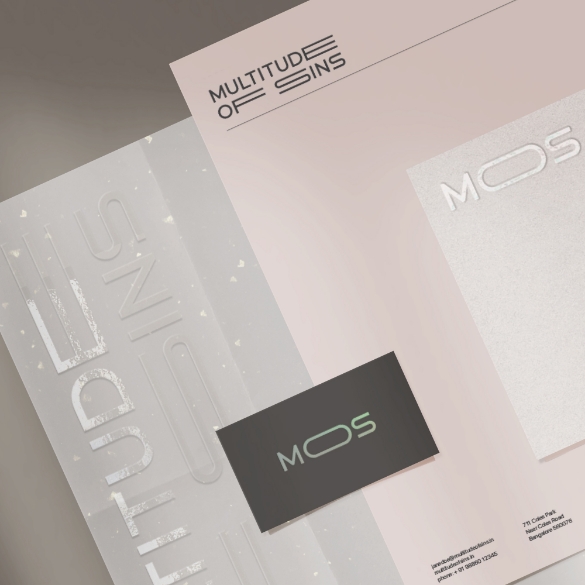
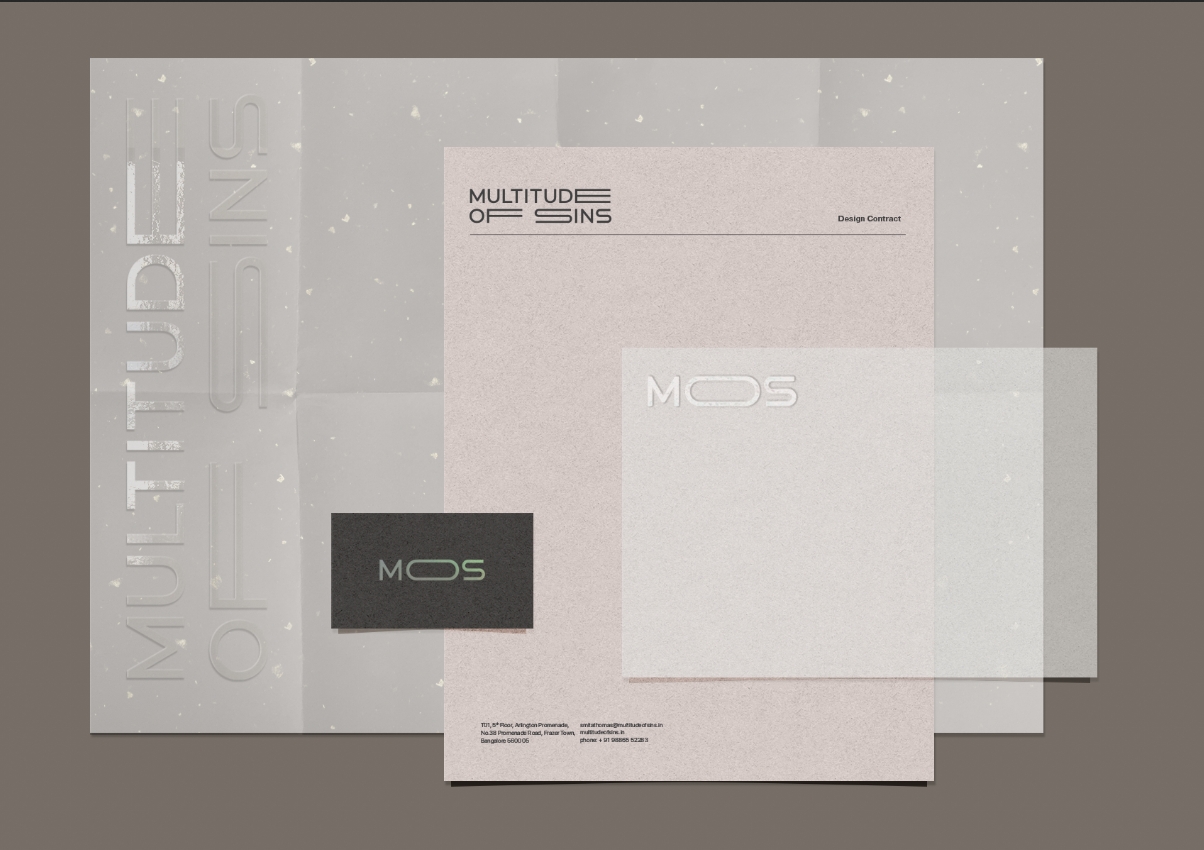
Her logo was created using a sans-serif font, with customizations on each letter that allow it to shrink or expand. The monogram (a required thing in brands with long names) is a condensed version of this.
Structured in a way that both fit neatly into rectangular spaces, which gives one the opportunity to build endless things with it - much like a lego piece with a clean geometric shape.
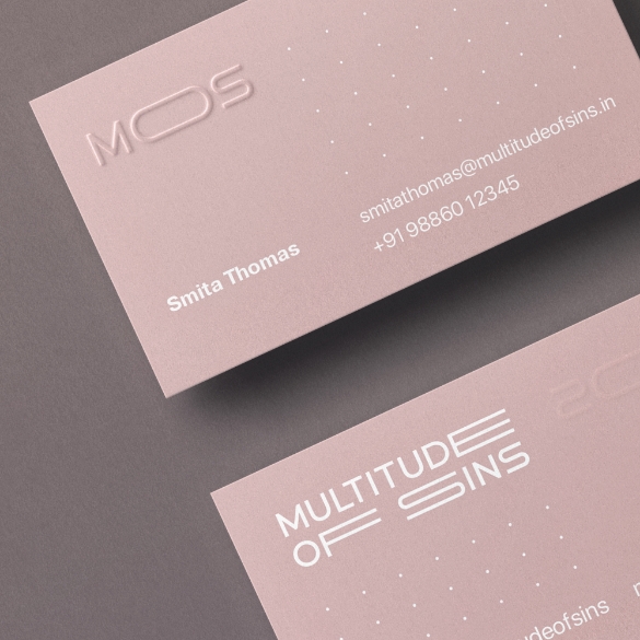
To create her visiting card, we had to put as much thought as an architect does, into their materials and textures. As a design studio, we are always excited, and always celebrate the arrival of a new kind of paper available in India.
Thanks to Sona papers - this new swatch book by Arjowiggins has opened up endless possibilities. And this is what we used to design the visiting cards for MOS using the shade - Old Rose in 350 gsm. ⠀
Smita is a creative maverick person who does stuff because it gives her joy. However, her background is that of a lawyer so she is also meticulous, analytical, and organized. The website had to reflect all these faculties - from the right brain to the left.
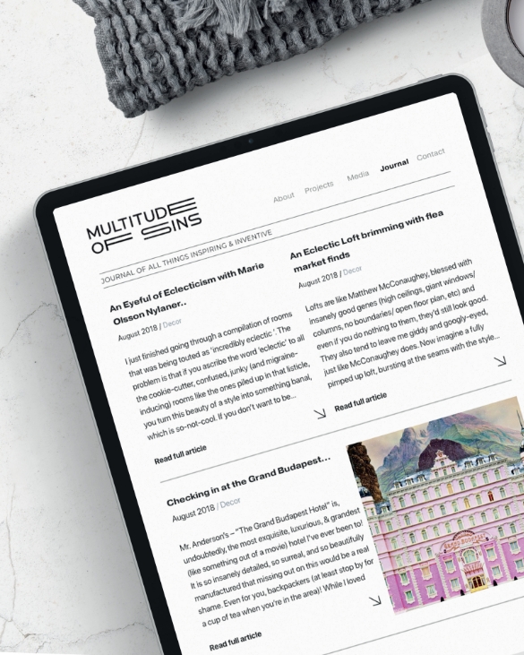
It is a unique opportunity to custom design a website from scratch, and for a project as complex as this, it was imperative. So we create these grids, left them visible to represent her sense of organization, and filled pieces of information within them, an oversimplified version of a right brain works. This could also be described as an analog + digital newspaper-style grid system, with every scroll functioning like the turn of a page.
Her love for merging various things was represented through a splash screen with a collage of what we think resides in Smitas brain - balloons and old clocks, steampunk machines, and ghost rabbits. It's an element of surprise that greets you at the door. With a name as whacky as Multitude of Sins, one must create a manifesto, elaborating on the sins - explaining the method in the madness.
A repository of Sins - the Multitude of Sins manifesto.
Pride: Pride in #MOS’ parade of misfits and oddballs, each a creative genius in their own right. From tile layers to artists, electricians to furniture designers here is a thank you for bringing each of my reveries to life.
Envy: Envy of all the fabulous minds in this world (and their fabulous creations) who inspire me to push my boundaries & well, keep me on my toes, allowing me to push #MOS harder each time.
Gluttony: Gluttony in savoring every taste, smell, and moment that my creative process offers.
Wrath: Wrath at all things cliché. Exploring authenticity and being the antidote to brash commercialism is #MOS’ lodestar.
Sloth: Sloths like patience when it comes to locking down on the details. None of the good things in life can be rushed, especially when it comes to crafting eclectic detailed spaces with soul.
Greed: Greed for sensorial stimulation. From street fashion to couture, from punk rock to string quartets, from the smell of dusty attics to sounds of crickets in a misty meadow.
Lust: Lust for the unknown. Each creative journey leads you down serendipitous paths that eventually bring you to a delightful destination.
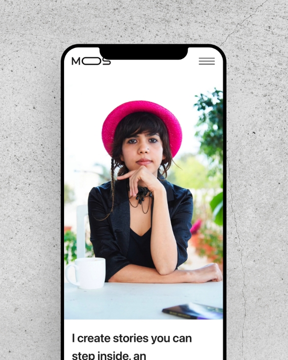
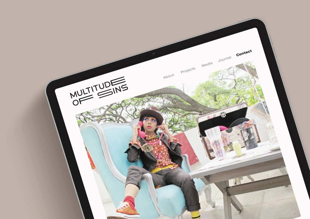
On web design projects, the responsiveness between devices should not be left to chance, or to the judgment of a developer. Every pixel here is designed individually for desktop, tablet, and mobile, so the outcome on every device is pixel-perfect. One must accept that 80% of all content is viewed on mobiles, and hence, the experience has to be optimized for that.
Through this project, I can claim that our forte is to be able to tell other people’s stories with grace, and humility and to subtly represent the values of the entrepreneur through design.
Next Project
